Coordinating Clutter Co.
I had the pleasure of helping a local entrepreneur with developing branding for her home organizational solutions business. If you need some organizational help in your life, get in touch with Tori at CoordinatingClutterCo.com!
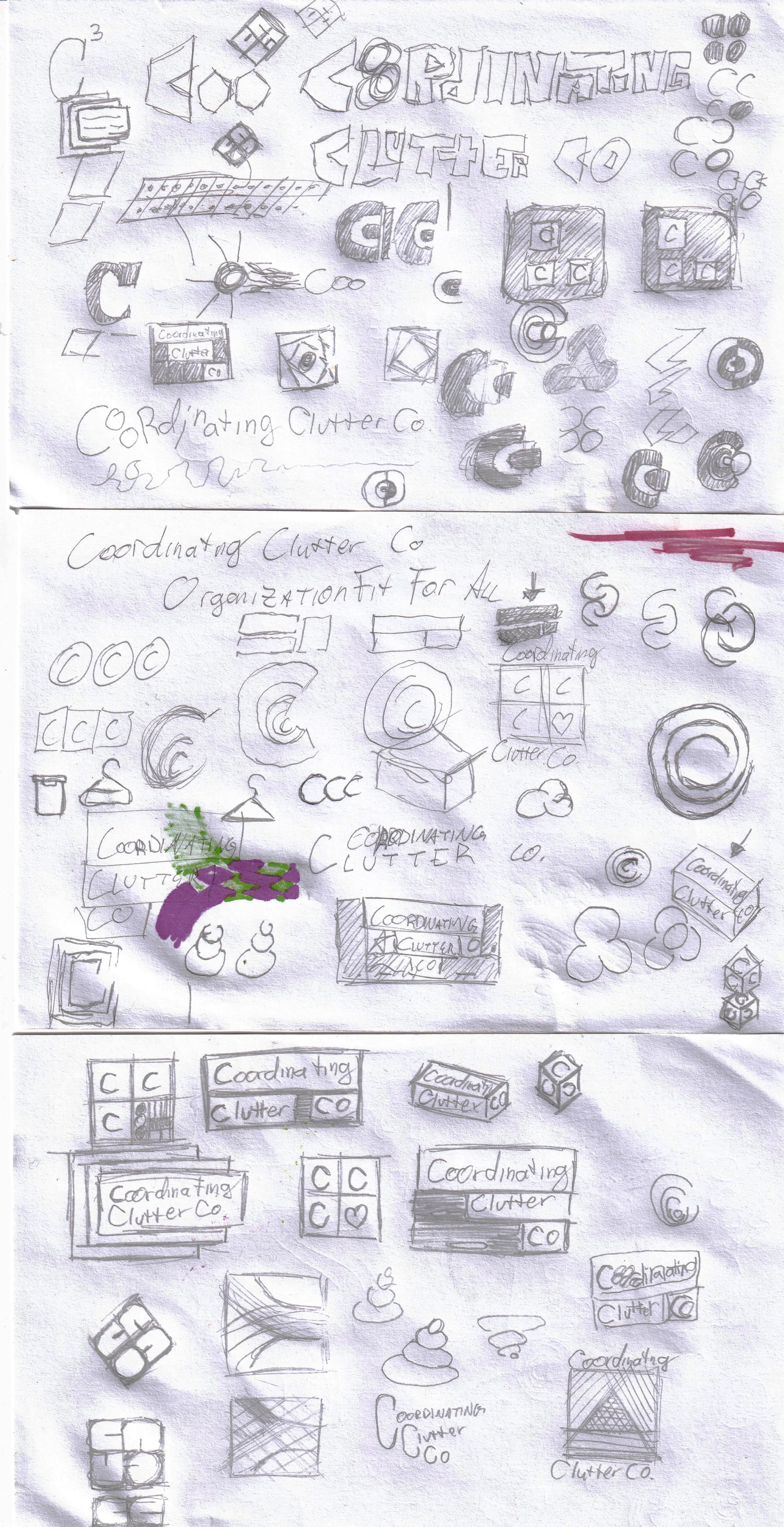
Like all great logo and branding projects, this one started with a healthy amount of scribbles explorations and not super great ideas. But luckily, you only need a couple good ideas to make a good logo. We started with an initial questionnaire to give me sense of what the client was looking for and got into it from there.
Research
& Ideation
& Sketching
& Elaboration
We ended up making the word mark with a clean font and tight kerning to reinforce a clean, tight organizational structure with the option of 2 different alternate logos that represent options for organizational solutions. They’re inspired by a stack of boxes and a drawer organizer
Logo done:
Now to brand things.
The next task was to design more of the brand. This mainly consisted of color choices, a pattern, and potential use cases. The colors requested were green and purple. This presented issues because these colors tend be used to represent chaos. Notable uses of a purple and green color scheme are The Hulk and The Joker, both characters you wouldn’t necessarily associate with their organizational skills. I believe we struck a good balance between the lively energy of the colors and a harmonious undertone by utilizing a mostly monochromatic purple scheme with the option of a mint accent. This is the brand presentation that I provided to the client after minimal adjustments.


